top of page

UX of Yellow
21 Oct - 11 Nov
Design Breif
Design an experience based on the characteristics of the color yellow.
Back To Top
Team

Cultural significance of yellow
Yellow is special. We realized the significance of yellow present in different artefacts within our lives. We were mesmerized by the different meanings associated with yellow in cultures across the globe. Hence, we decided to begin with an artefact analysis around the cultural significance of yellow and its properties.

WEEK 1
Artifact analysis on Candels
Candles are the signature of warmth and yellow light spreading happiness. We were excited by the cultural significance of candles within the spectrum of emotions beat candle marches or birthday cakes with candles. Hence, we decided to take it up as our artefact and analyse it.

Playing with light and shadows
Artefact analysis helped us get inspired by the playful history of candles involving light and shadow. In the 18th century playing with silhouettes formed by the light of candles emerged as the most popular evening game (Vigarello, G., 2016). Likewise, light and shadow have been immersed in art. In the renaissance, the time of humanism and realism, perspective light views transformed the paintings.
"Fascinating lantern light shadow play"

The idea of the silhouette was still catching our breaths, and the way it has been used for storytelling in the past was mesmerizing. However, we were not yet clear on what we want people to experience.

Feedback from course leader
We decided to get feedback from our course leader to improve our design directions and understanding.
Make the connection with yellow clearer
make it more conscious
How do people express yellow? What does it allow people to do?
Look for the human visual system aspect
plato's cave
Find stories of absence of yellow, disappearance of natural yellow
What are you trying to find out with your research method
Make it new, critical and interesting

Yellow percived as caution
Post the feedback session; we got more interested in stories of the absence or excess of yellow and how people perceive yellow around them. Yellow is an eye-catching colour that draws attention quickly. It brings out a sense of urgency and caution and has been used over the years as a medium to express critical messages. Nevertheless, although we see signages all around us, we choose to ignore them.
"Yellow brings a sense of caution and urgency."
Ignoring caution
No sooner have we realized that our ignorance towards critical messages has not just turned our lives upside down than they brought us into the realm of climate emergency. We are hearing, seeing, and understanding the impact of our actions and yet choosing to ignore them. We see several post-apocalyptic world movies reinstating the memory of an unsurvivable environment as the consequences of our actions, yet we are doing the same old things.
"How bad the world has to be for us to realize?."


Week 1 Presentation
The experience
Within the closely knit relation of climate cautions and involvement of yellow in a post-apocalyptic world, we carefully curated the experience of a participant travelling into the future where they meet humanoid AI. The AI takes the participant through a series of steps to prepare them for the outside world's harsh climate and livelihood.


Week 1 feedback
Staging and quality could be better
Allow the participant some room to explore
The outside world is yet
not experiential.
What do people think they need in the future?
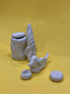
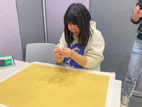
In week 2, we were more curious to understand what people think they would need in the future to survive. So, to allow their minds to wander freely and give them the freedom to express themselves, we decided to present them with a toolkit having clay and a few other materials.

WEEK 2
Making outside world experiencial
We used cardboard, paper, dried leaves, black soil, and lighting effect to multisensory.

Improvising experience
We added more potato items to the food menu. We also added pale yellow water to make them feel the water pollutants. We also added alarming audiovisuals to bring the sense of urgency and weave the experience with evacuation into the future due to climate catastrophe for smooth context transitioning. Finally, we included more layers of protection aligned to human vulnerability in future climates.


Week 2 Presentation

Week 2 feedback
Physical time travel shoed earlier was better than digital.
--
--
Citations
Vigarello, G., 2016. The Silhouette: From the 18th Century to the Present Day. Bloomsbury Publishing.
bottom of page


.png)
.png)
.png)
.png)